This is a brilliant insight into one of our Unit Partners, Elliott Packham and his exciting work by Ruth Millington. Ruth is an art critic and writer, specialising in modern and contemporary art. She has written for various publications, including the i newspaper, Telegraph, Daily Mail, Sorbet Magazine and BBC Online. She has been featured as an art expert on TV and radio, including BBC Breakfast and ITV News. She also writes a blog about art and culture in Birmingham where this post originates. It is reproduced in full but with fewer images.
Brutiful Brum: Q & A with painter Elliott Packham
After studying architecture, Elliott Packham turned to painting. Today, he depicts the ‘concrete jungle’ that is Brutalism, celebrating and capturing the simple block-like geometry of this bold architectural style. I caught up with him to find out where this love of all things Brutalist comes from and how he makes his mesmerising modern architectural paintings.
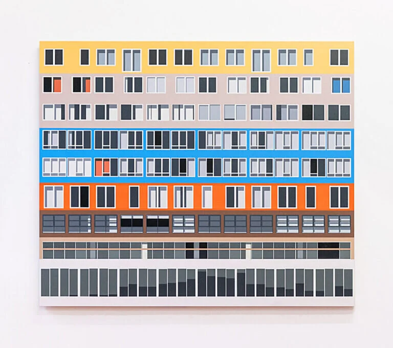
‘Silodam’ by Elliot Packham
‘Renamed’ by Elliott Packham
You started out by studying architecture, can you tell me a bit about that?
Yes, I initially studied architecture at university. However, I wasn’t ready for the rigours of architecture school at the time and I decided to move on after the first year. My work today still draws on the fundamentals that I learnt during that year, particularly when it comes to technical drawing and architectural history, and I’m very thankful that I had the opportunity to study something I’m so passionate about. I have the upmost respect for those in the profession and classify myself simply as an architecture fan these days.
And then you came to Birmingham – what brought you here?
I moved to Birmingham in 2012 in order to have a second attempt at university! This time my chosen subject was a joint honours degree in Business Management and Spatial Planning at the University of Birmingham.
“To me, Birmingham felt welcoming, diverse, unpretentious and on the rise”.
At the time I distinctly remember feeling a strong affinity to the city when I went to explore after the Open Day. To me, Birmingham felt welcoming, diverse, unpretentious and on the rise. After my 3 years at the University, I was very much attached to the city and have lived here ever since.
How do you choose buildings to paint?
I try not to visit a place with the intention of photographing a particular building in order to paint it. Instead I tend to just explore an urban area with my camera and see what I come across (it’s more exciting that way!). It’s partly for this reason that most of my paintings are based on buildings that aren’t widely known other than locally, with the possible exception of my most recent work based on the Silodam Building in Amsterdam.
I’m attracted to a broad range of modernist architecture, although I do have a particular passion for the bold structural forms of brutalism, with its clean lines and geometric design. Although my work is primarily a depiction of a buildings’ form, I also like to imply the presence of human occupants by including the irregularities they create in the building’s façade. For example these could be curtains or objects visible through the windows.
What’s your favourite building in Birmingham?
I’m going to cheat here and say two buildings, but I think that this is allowed because one of them has been demolished!
The first is Birmingham Central Library (the old one), which was demolished a few years ago. I generally like functional and utilitarian buildings, words which I think perfectly describe the old library. Regretfully I never got to go inside as it closed shortly after I arrived in Birmingham, so I had to contend myself with admiring it from behind the construction hoardings!
The second is the Muirhead Tower on the University of Birmingham campus. Much like the old Central Library, this building is either loved or loathed, but I’m most definitely in the former category. As a student I spent plenty of time there and always enjoyed the industrial, interior with its exposed concrete, metal pillars and double height glazing.
A lot of people don’t like Brutalism. What is it about this style that attracts you?
I love the honesty of Brutalist buildings. They are unfussy, clean and minimal with no ‘decoration’ to speak of; everything you see serves a purpose. You can therefore gain a good understanding of how the building was constructed just by looking at the exterior. Aesthetically I’ve always been attracted towards functional design, preferring simple shapes, straight lines and exposed materials, so Brutalism definitely taps into this.
What do you think about new buildings being built in Birmingham? Are you interested in capturing change?
Change is exciting and even in my eight years of living in Birmingham, there has already been a lot of it! Birmingham is being really ambitious with its Big City Plan and I’ve thoroughly enjoyed seeing how transformative developments such as New Street Station are revolutionising the city. Of course, it’s important that the city’s heritage isn’t lost (hopefully no more iconic buildings like Birmingham Central Library will be demolished!), but in general I’m looking forward to seeing how the city’s new buildings will add to the urban environment.
Change has played a role in my work before and I’m sure it will do so again in the future. For example my painting, ‘Western,’ is based on a tower block in Reading that was about to be demolished. The work consists of 4 separate panels focusing on the same corner of the building but at different times of day, going from early morning, midday, evening and dusk. I chose to do this in order to represent the fact that the building was coming to the end of its lifecycle and change was inevitable. The building was demolished a few years later.
What’s your process? Do you take photographs and work from these?
Yes, I start by exploring an urban area with my camera and when I come across a building I find interesting, I photograph it from different viewpoints. These then form the basis from which I paint. I like to then do a bit of research about the building and look at its architectural drawings if they are available.
I’ll sketch out details of the building and decide which elements to include, before settling on a final composition. Each piece is painted on an MDF board which provides me with a smooth, texture free surface to work on. Acrylic paint is introduced once the overall structure of the building has been drawn in, using masking tape to achieve the straight lines.
Producing art in a very controlled way using rulers, calculators, protractors, set squares and masking tape might not be everyone’s idea of fun, but I get a lot of satisfaction from the precise and clean nature of the result!
Who would you cite as your creative influences?
David Hepher’s remarkable paintings of London tower blocks first introduced me to brutalist architecture and legitimised the painting of, what many perceive to be, ‘ugly’ buildings, as an acceptable subject matter. He often works at a big scale (sometimes 3-4 metres), and this enhances the imposing forms of the buildings he paints, which definitely influenced my choice to paint large paintings.
There are also a number of architects who influence my work, notably Le Corbusier. Much of his work successfully combines simple functionality whilst also being dramatic and interesting to look at, something I hope to achieve in my work.
Is your studio a creative mess or as ordered as your paintings?
This question made me laugh! The studio is pretty ordered and minimal, although probably not quite to the same extent as the paintings. I find that this helps me concentrate, too much clutter stresses me out!
And you’re selling prints of the paintings. Where can people buy these?
Yes I’m currently selling limited edition fine art prints of my two most recent paintings in a variety of sizes. I take great pride in my prints and each one is checked, signed, titled and numbered by myself.
They are available as either a paper print or a paper print mounted on aluminium dibond and can be viewed/purchased on my website: www.elliottpackham.com
Have you continued to paint during lockdown?
I paint from my studio at The Old Print Works in Balsall Heath and they very sensibly encouraged all unit holders to work from home unless it was impossible to do so. I’ve therefore limited my time there over the past few months.
Whilst I’ve managed to keep some momentum going on my latest piece, lockdown has given me the opportunity to focus on some other areas, such as creating my website and developing the prints. I am very much looking forward to getting back into the studio more regularly though!
Do you think lockdown has helped us to notice and appreciate the architecture around us?
I’ve not ventured back into the city yet, but I’ve seen some spectacular images of deserted Birmingham recently. The buildings and urban spaces seem so vast without people or traffic occupying them and it’s amazing to think that we’re capable of creating such impressive structures.
However as someone who usually looks at architecture from an artistic perspective, I think lockdown has ultimately made me more appreciative of most basic things it offers us. Whilst I might not find my little shared house or local supermarket particularly inspiring from a design perspective, I’m very thankful that they’ve allowed me to continue living in relative comfort and safety throughout this difficult time.
That being said, I’m sure that many people, myself included, feel like they know the architecture of their own home a bit too well by now!
With huge thanks to Elliott Packham for taking part in this interview. Photography by Ross Jukes.
Ruth x
The full blog post with a range images including shots of Elliot’s work in his studio can be found here. Ruth has a great variety of other posts on all things Bright and Brum.


